27.8.11

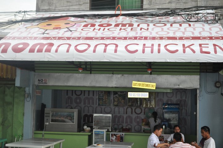
NomNom Chicken

From doodles and sketches for names and logo, the team from
NomNom arrived and agreed to call the food stop NomNom Chicken.
Client: Empericon Food Corporation (Bacolod, Philippines)
Design for front and inside counter plus backdrop.
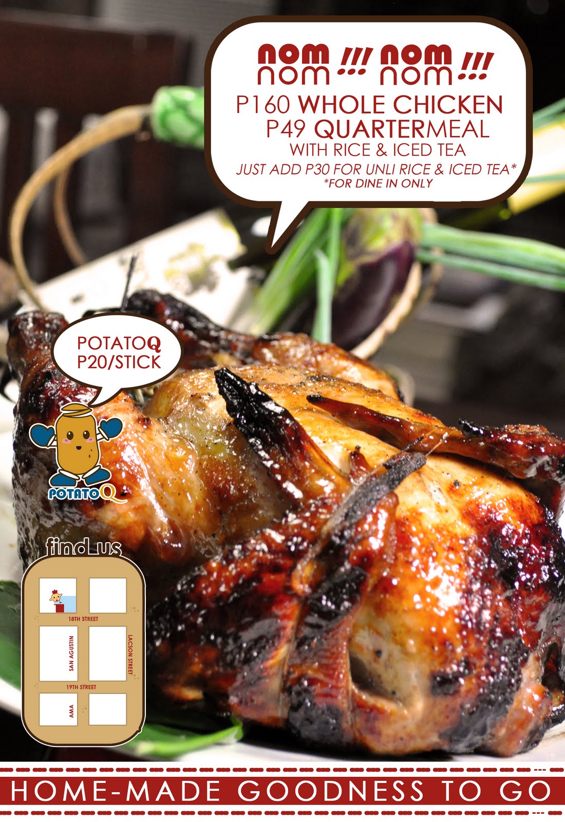
Mascots were suggested to attract student and to serve as an icon for easy brand retention.
Meet NomNom and Mr. PQ (PotatoQ)
The team requested for gift cheque.

You can visit them at: 18th corner San Augustine Street,
Bacolod City, Negros Occidental, PH
Like them on facebook/nomnom


26.1.11

T&V: Kook Kitchen branding

Logo shows happy colors--- fun and light, which is Kook's aim for clients
to feel when devouring their dishes. Printed on delivery items and aprons.
Logo study for the restaurant, details soon.
As Kook Kitchen joined in Mercato Centrale
e-poster were designed for promotion online.

T&V: Promotional Poster Glow at World Bazaar and Mecarto Central

Also, introducing new technology of coffee drinking in the Philippines,
single brew by Cordillera Coffee.

T&V: Glow Coconut Sugar at Coffee Week

Promotional e-poster for Coffee Week as Glow Coconut Sugar sponsor
Coffee Origin by the Philippines Coffee Board with healthy sweetener
Two weeks event held October 7 to 20 2010 at Greenbelt 5

I: Glow Coconut Sugar at WOFEX

WOFEX 2010: August 4 to 7
Glow Coconut Sugar got the corner booth, we used coconut leaves to decorated the booth, tied up one to look like a coconut tree and placed it on the corners of the booth. Tarp covered the back, with coconut plantation images. We used brown sacks (recycled) and stuffed with newspaper to be used as display stand. All in the client was happy with the minimal expense--- just the tarps.

Also agreed with the organizer for Glow to have a short demo of coconut sugar application and some lecture from the project head. Ms. Manohar.
Invited Chef Elaine of Kitchen of Carla and Elaine's to do a demo along with Chef Robert.

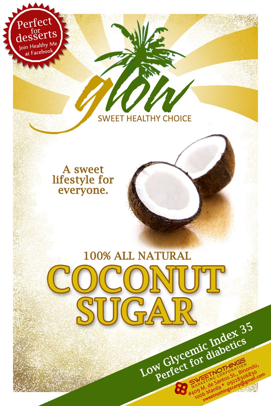
UPDATED: T&V: Glow Coconut Sugar Label

Glow Coconut Sugar's Label (left: unofficial; right: as used in the market)
We used sun ray's to emphasize the word GLOW, and to make it bright and seemed glowing from a far.
You can visit their website for more information about the products: http://sugarforhealth.com/product.php
Update:
Studies for the new label and new product to join the line
First three labels used a different logo for Glow, but it has been decided that since brand identity retention for the previous logo has been build it should be retained.
Balls & Bits brand for the coconut sugar rocks
Same earth colors in modern approach.
Chococo, a healthy chocolate brand under Glow Coconut sugar line.

4.7.10

UPDATED: T&V: Logitech Banner and Microsites

Banner ad on Yugatech blog redirected to Logitech's microsite,
developed by Richmond Ibasco.
Another job came from Logitech, this time they need a permanent microsite to use everytime they have a promo. The promo for this project is for the Logitech MK520 Wireless combo promo. Chose to purchase logitechpilipinas.com, so that it won't be any different from the Logitech website thus still be know as the local website for Logitech.

T&V: Clipper Industries

The original Clipper Industries corporate identity from way back.
Now, Clipper's new look at the new age.
Retaining the clipper but movement is faster and more solid.
Logotype resembles the original, so that brand identity won't be totally lost.

21.6.10

T&V: Sugar for your Health

The website for the new brand of coconut sugar which promotes wholistic healthy lifestyle, http://sugarforhealth.com
The website was updated to a new template after some months.
Here's the complete product line that will be featured in the site.

31.3.10

T&V: SweetNothings Marketing Corp.

SweetNothings Marketing Corporation
is a company that distributes cocosugar.
You can contact them at sweetnothingscorp@gmail.com

Red because it is the boldest color that can mean all the luck, and
tangled S and N to form endless knot-ish symbol, which again is an auspicious symbol.

16.2.10

T&V: Ticket Design for GFAP-Youth Speed Dating

Two of the ticket/calendar designs that was used for the event last February 7, 2010.
Submitted along with other design of co-designers on the ass'n, was chosen by the elders
to be the official ticket for the event.

28.12.09

T&V: Calling Cards


Place in the watermarks used on the photos in the blog and the Chinese seals of the repective contributors.

T&V: Blog Logos


Chinese seal that reads as cha li za sui gong chang,
to show chinese-ness of the blog.
Wok, was also used to present the same attribute,
as Woks are used to cook for chopsuey and by Chinese.
The name is such because the blog talks about all/mixed cuisine.

A blog by Chef Anthony Consing, gym buff and girl magnet.
He is the one being represented by the toque and the blog name.